The Bread Bowl
Update
!!!
Update !!!
Soup anyone?
The Bread Bowl is a fictional soup restaurant I decided to create after my latest visit to Canada. While I was there I frequented a hole-in-the-wall style soup restaurant called Soup Surreal for lunch. I have always adored soup and have been into this restaurant before on multiple occasions. With the onset of the COVID pandemic, they were forced to do takeout only service but luckily it made for the perfect takeout lunch spot in town. All their soups are freshly made and most importantly, are absolutely delicious!
After signing up for the Daily UI challenge and having multiple prompts to create menus and various interface components, I found myself using the idea of a soup company throughout these designs. This sparked the idea to make my own fictional soup restaurant inspired by Soup Surreal called The Bread Bowl. Day 43’s challenge was to create a food menu. This quickly turned into a side project creating a hypothetical app for The Bread Bowl using Adobe XD.
First Iteration
So as you can see, the first results were pretty horrific. The colour scheme is questionable at the least and the whole UI is very stale - not what you want from The Bread Bowl at all.
Where it is at now…
So I think it is important to note here that the following video is only showcasing the second iteration of the app design and is by no means complete. The Bread Bowl is a side project I hope to build upon over time as a personal development project and a bit of fun too! Maybe one day in my retirement I will bring it to life but for now, I’ll enjoy chowing down on the fresh soups provided by what inspired The Bread Bowl in the first place - Soup Surreal.
The Video - Music: www.bensound.com
I Made More!
Well, the title says it all! After a brief hiatus, while my full-time job picked up a bit, I managed to get back to work on my make-believe soup shop of dreams!
Most people usually start with a website then move onto an app. Apparently, I’m not like most people.
Yes, I did ‘publish’ my app prototype first, however, I began working on the website at roughly the same time.
The rest of this page showcases the website and some of the development involved in designing it! So, without further ado…
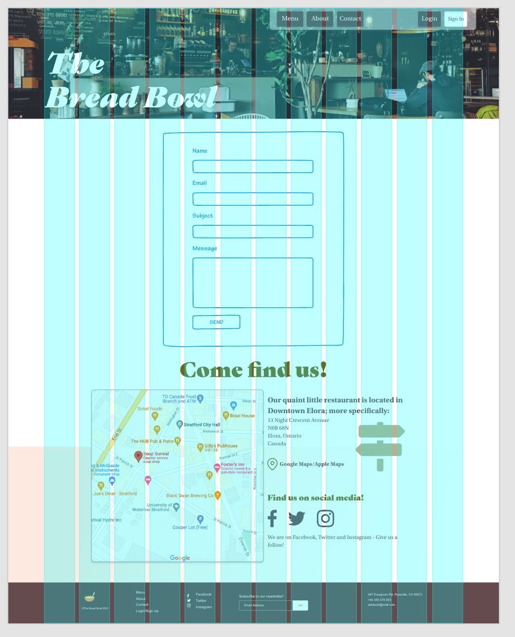
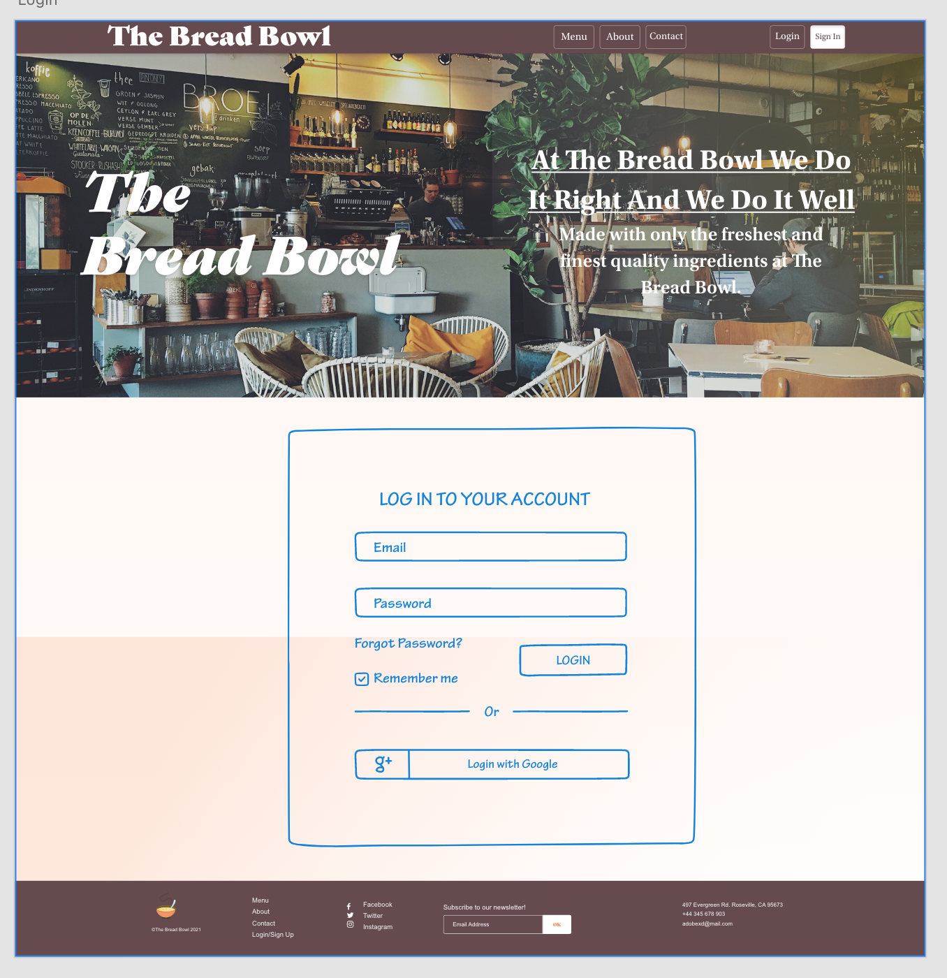
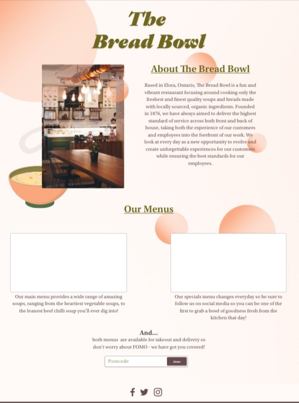
Above are some screenshots of the website during the build. The top left image is showcasing the beginning concepts of a “Contact Us” page, using a 12 column/Bootstrap grid to guide the ideation. The central image shows the beginning wireframes of a login page that is yet to be included in the prototype. Finally, the screenshot on the right is the first iteration of the “About Us” page.
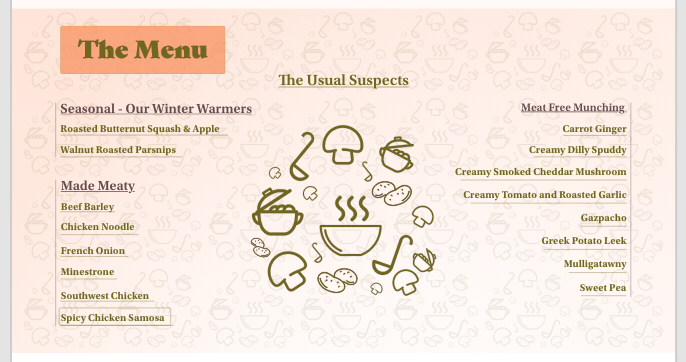
The bottom left shows one design I had iterated for the menu but ultimately decided against. I decided to show design this though as I believe it is good to show my whole process, even if I don’t like what I made - for whatever reason that may be. In this case, I decided against the design as it displayed too much visually and didn’t prioritize user-friendly-ness.
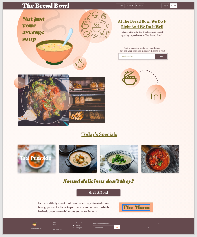
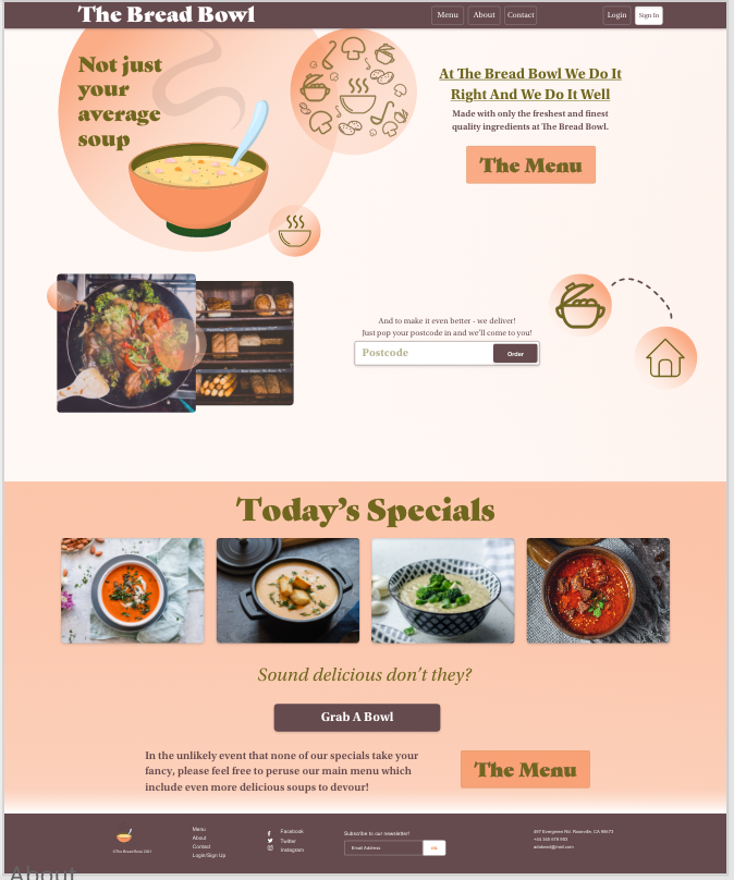
The final two screenshots again show designs that I had decided against. I decided against these designs as I had learned I went about designing completely wrong. Instead of taking the design through from a basic wireframe, to a low fidelity design, and then building up to a higher fidelity design, I just went headfirst into a high fidelity design. I would highly advise against this.
I wasted so much time trying to get the perfect colours, fonts, and gradients when I should have been simply establishing basic blocks to build up from. Because of this, I wasted a fair amount of time on designs I ultimately decided to scrap. However, part of me is glad this happened as I have learned from this.
Now I have learned to follow a much better process. I like to use a ‘hand-drawn’ wireframe first, making sure it fits in with the Bootstrap grid, then fleshing it out with basic block shapes. Once I have done this I like to add more detail to the design, using images and appropriate fonts, etc.
I find this process to be extremely effective for time management as well as it ensures I don’t get lost in trying to get all the small details included in the design too early on when it’s not as important. Starting with the basics and building up step by step from there allows me to focus on the whole design and not waste time getting caught up in the fine details too early on in the process.
For this project, this process works perfectly as I am undergoing this as a side project so do not have as much time to dedicate to it as I would like.
https://www.bensound.com/
Here I would like to introduce you to the first iteration of The Bread Bowl’s website! Is it great? Nope! But that is okay! Just like the app, the website is a work in progress but even then I am very proud of it.
I made some updates!
Only small ones but I decided to refine the UI a bit more and remove some visual aspects I felt were not needed. Oh and also I’ve added a Login and sign up page! The next update will include a profile page to match this as well 😊 Anyways, I hope you enjoy the updated website!
Update
!!!
Update !!!
I made some MORE updates!
As I said above I have added a login page, signup page and even a profile page with editable fields! I hope y’all enjoy some more Bread Bowl action 😂

